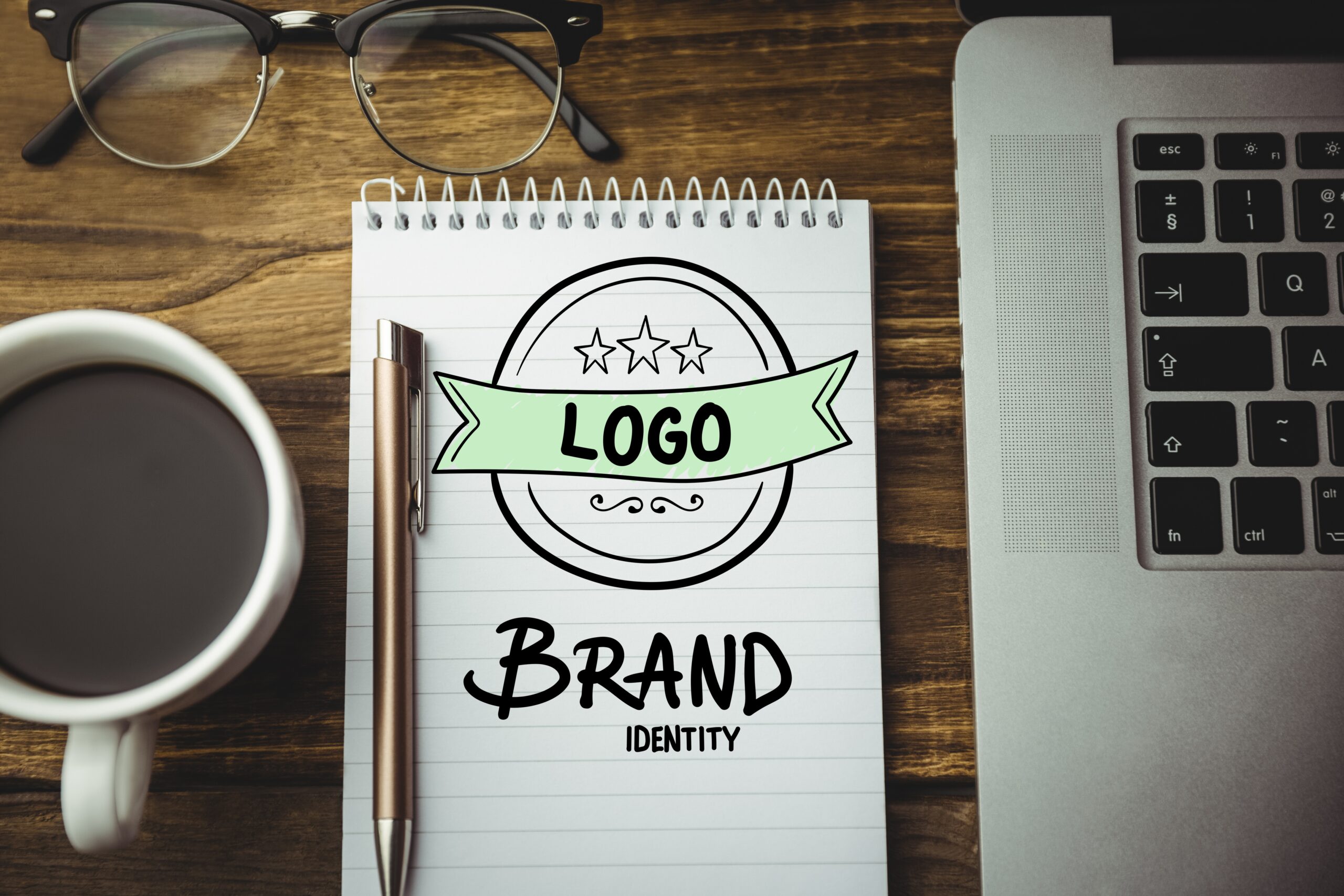
Why a Simple Logo is Right for Your Business?
In the last years, many companies start using simple ideas for their logos, We’ve all heard the phrase ‘take time to smell the roses, but unfortunately, modern life rarely allows us that pleasure. Consumers will usually just take a fleeting glance at a logo, especially if they’re zipping past a branded lorry or a road sign at 70 miles per hour, so you need a clear identity to catch their attention. If for example, a customer is looking at your packaging design on a crowded supermarket shelf, chances are they’re not going to waste any of their precious time trying to decipher what it is you’re trying to communicate. What’s more, research has shown customers are more likely to gravitate towards simple design when selecting a product. A good logo designer will consider important aspects such as making sure text is legible, brand names are prioritized and the purpose of the product is immediately obvious.
The truth is, a simple logo can cut through all the noise and show off your brand’s true essence—which is super important to the growth of your business.
Today, people are interacting with brands more than ever before, even if they don’t realize it. Whether on social media networks, TV, radio ads, or emails in inboxes, brands are everywhere.
That’s why having a strong brand is crucial if you want to survive. A great, simple logo design that resonates with your audience and forms a connection with them will help separate you from the competition.
And, a simple logo allows you to make more of an impact than a logo that’s jam-packed with imagery and color, because it allows you to quickly communicate your brand’s message and character.
So, let’s talk about what goes into a simple logo design, some examples of famous brands with simple logos, and some actionable tips for creating your own!
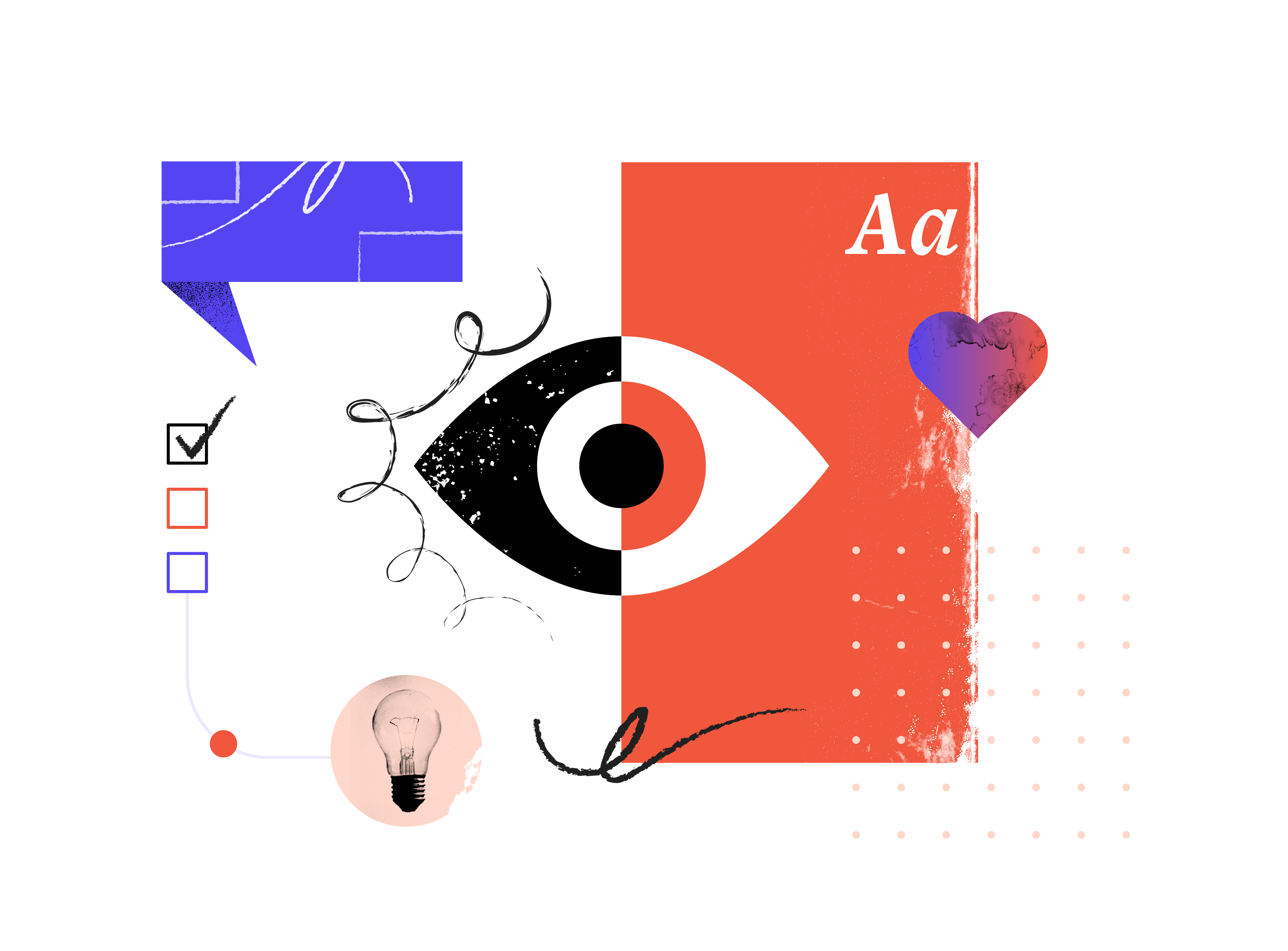
What Goes Into a Simple Logo
When it comes to logo design, sometimes less is more. Think of design concepts like minimalism and negative space; minimalist logos, like flat logo design, use a single, versatile design that can be applied across backgrounds and mediums.
People are more likely to trust something they’re familiar with, so they need to be able to recall your logo easily. An intricately designed logo may look impressive initially but it’s going to be harder for a consumer to familiarise themselves with it. The simplest logos are able to embed themselves deeply into our minds so a fleeting glance is all that is required to recognize them. Think about driving past McDonald’s famous yellow ‘M’, we can even recognize it in our peripheral vision.
Simple logos are often just wordmarks (i.e. a business name without any imagery), or designs that use a very simple icon. By stripping away any “extra” elements, you’re left with a logo that looks good in all contexts.
if you want your logo to make an impact, there are other fundamental principles you need to follow:
- It should be memorable, so your audience won’t forget your brand in a hurry
- It should resonate with your audience, meaning it has a specific style that THEY find attractive
- It can be used it in a wide range of formats, like digital advertising or printed out on physical items
- It should reinforce your brand’s character and message to help make a connection with your audience.
I hope you enjoy reading this newsletter if you want to hear more about us you can subscribe to our newsletter for more content
media@aternet.io