Color Psychology
In this article, we will explain color psychology to help you understand how colors work and how to use them right to make your logo different and how to choose your matching color palettes for your logo message.
Color choices give your logo a visual connection to your company’s values and personality. The right color combination can show masterly the feeling behind your company story. As we know integrating company business graphic elements is one of the important things in the logo but also the color is by far, one of the essentials to convey your logo’s message.
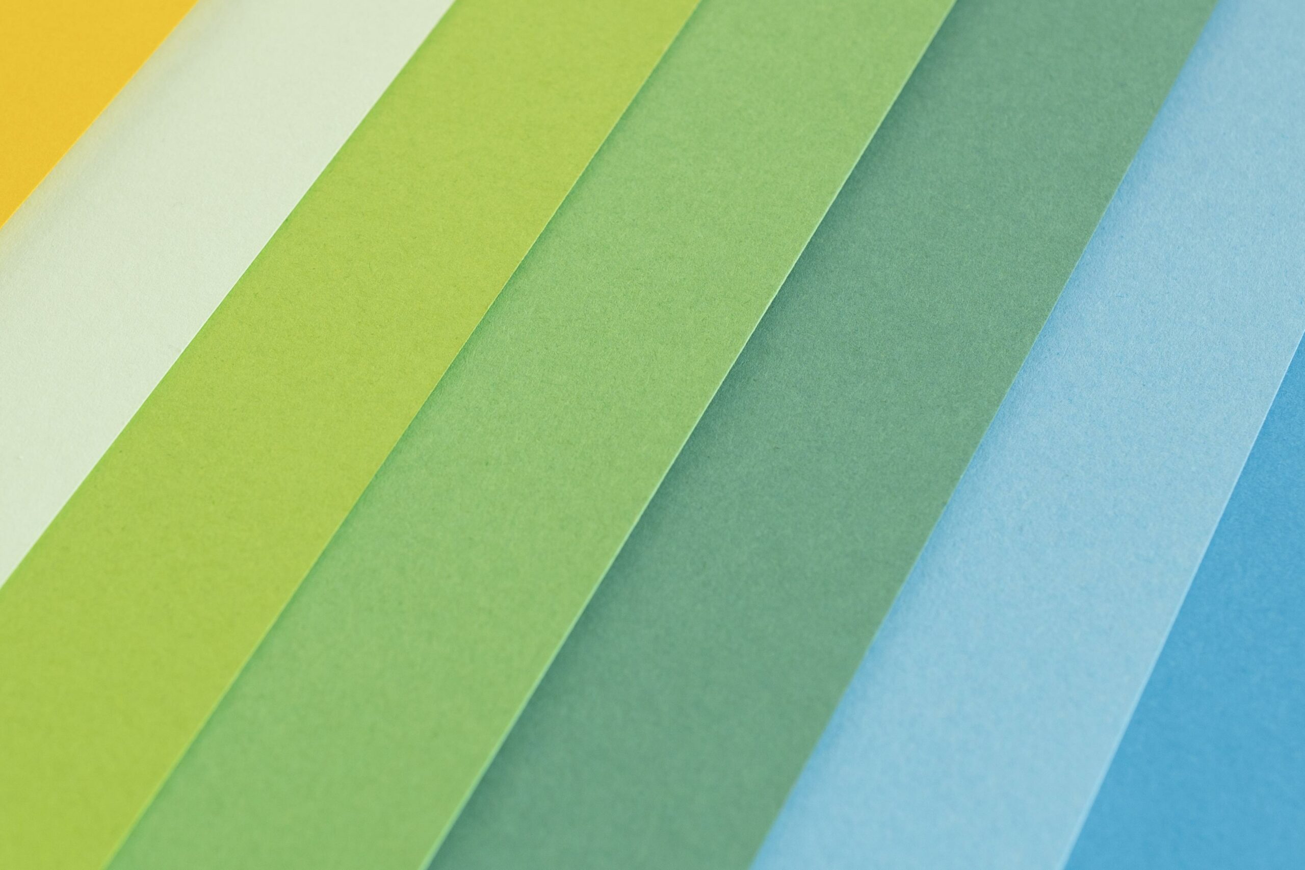
Science has shown Color digs deeper into human psychology, our brains react in diverse ways to specific colors. By understanding how each color affects the mind and the emotions it stirs up, designers can benefit from harnessing and incorporating it into their designs and also create a more effective brand. It’s important to remember that this is a nuanced and complex field that requires careful thought. Consider how each of these colors affects emotions and psychology:
Yellow’s Color Psychology
This warm vibrant color is often associated with sunshine and is a shining example of friendliness and cheer. boosts mental activity, makes us cheerful, and generates muscle growth. Brands that are seeking to draw in consumers with a comforting, warm embrace and youthful energy should look toward Yellow. Additionally, the color can radiate a playful and affordable identity but too much yellow makes people impatient, and too little yellow causes negative feelings of insecurity, fear, isolation, low self-esteem, and many more. So, it is best to use the color yellow in a balanced way in your logo designs.
Blue’s Color Psychology
Like the calm color, blue Represents Professionalism, knowledge, Authority, Power, and Trust. Blue is a great choice for logos as it creates a sense of confidence and security like healthcare and medical brands and it can be very refreshing. However, overusing blue can make a brand appear cold and detached.
Red’s Color Psychology
One of the primary colors and a universal symbol of passion, anger, and excitement, and the most popular among extroverts and males red is a popular color in branding. If you’re looking for a loud, playful, and young brand image, red is an ideal option. It is dynamic and definitely your go-to color if you want to get people’s attention – that’s why you can observe “buy now” or “click here” buttons all over the internet are colored red.
Green’s Color Psychology
The green color is one of the more restful colors that represent the environmentally friendly business. usually used by agriculture, gardening, and energy companies. it gives a relaxing and calming effect to represent growth because the green color doesn’t force the eye to make any adjustments, for brands that are looking to portray an opportunity for fresh starts and safe can consider green as the main color
Pink’s Color Psychology
people considered pink to be the most feminine color and is generally used in logos for brands targeted at women. brands that employ pink can retain a sense of energy and cheer blended with a perception of soothing calm. It is also associated with sweetness and is seen in logos for sweet foods like ice cream and donuts. It also shines a nurturing light that soothes and reminds us of the feminine principle.
Gray’s Color Psychology
gray is one of the most neutral shades available. Brands often choose it for its timeless, practical, and unbiased feeling. It’s ideally used as a secondary color to provide a calmer and more neutral background to bold colors, though some companies (like Apple) use it with resounding success.
Black’s Color Psychology
black can still be a powerful color to include in branding and is traditionally seen as a symbol of professionalism and seriousness. Black is traditionally seen as a symbol of professionalism and seriousness. However, it can also be used to elicit feelings of elegance, substance, and power. Brands that pick black are looking to make a powerful statement and convey a sense of authority and respectability.
Summary
Colors are an important aspect of your brand’s identity. And keep in mind though that a color’s meaning varies in different countries and cultures; what meaning you may know about red is totally a different perception in different parts of the world. Also when you design a logo, you should take some time to consider what each color says about your company. Understanding the right blend of colors can help you better communicate your message.
Here are some best sites to generate the right colors for your logo:
https://www.canva.com/colors/color-palette-generator/
https://color.adobe.com/create/color-wheel
And if you need any assistance in creating a logo ATermedia is the best choice to work with we have the best-talented team with more than 5 years of experience working with small companies to big companies, trace a big smile on the face of our customers and we want you to be the next one so feel free to contact us we are waiting for your touch thanks.