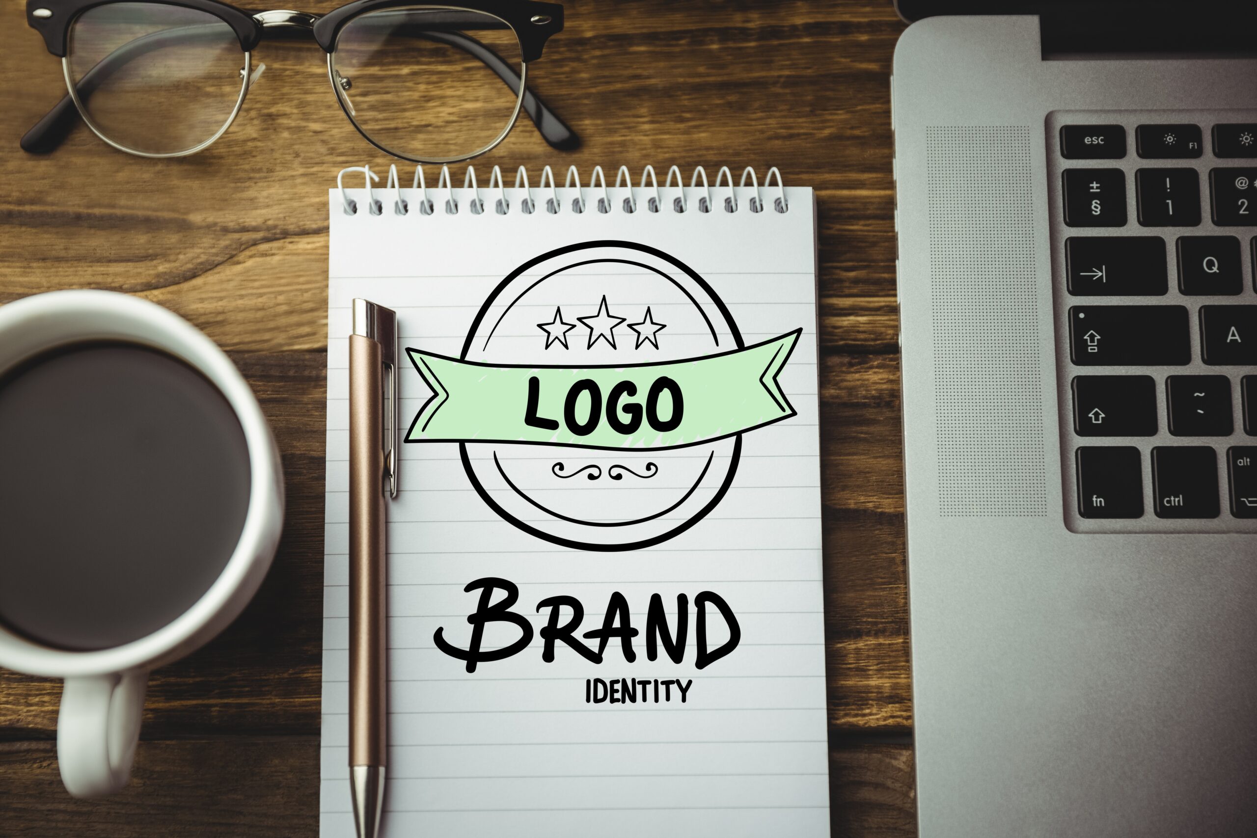
Monogram logo: the perfect way to luxury up your business:
A monogram logo is a perfect way to make your brand stand out as the epitome of class and luxury. Monograms are used by some of the world’s most prestigious brands, from Gucci to Tiffany and Co., to signify quality and sophistication, and so they’re an excellent choice for anyone looking to elevate their brand with an air of poshness or opulence. If you’re ready to elevate your own brand, here are some tips on how to choose the perfect monogram logo.
What exactly is monogram logo?
Also known as “lettermarks,” or “Initial letters logo” are a type of logo that is made up of only letters. These logos generally range from two to three letters and sometimes it can be more than that depending on the letters used in the logo and are made up of the first letters from your business name.
When should you use this kind of logo?
Monogram logos are ideal for businesses that want to create an air of exclusivity and want their customers to know they offer quality products or services. The reason why monogram logos are so popular with luxury brands is because these companies offer products or services at a high price point; therefore, using an initial letter mark helps them differentiate themselves from other businesses offering similar products or services.
What are benefits of using an initial letter in a company’s logo?
By using a monogram logo in a company logo, you can convey a sense of personality and brand identity to your customers. And it can be designed in any style that suits your business. Using an initial letter also creates a visual link between the company and its name that can be traced back to the date of incorporation.
As the first impression of any business, your logo is essential to establishing your brand identity. By incorporating an initial letter into your logo, you can convey a sense of style and professionalism to potential customers.
It’s a great way to personalize your business branding while also making it more memorable and distinctive.
It’s simple to make a scalable design out of a monogram logo without losing clarity. Everything from smartphones to tablets can be tailored to fit your brand, and your brand will still be recognizable. Even monogram logos that are small are still easy to identify.
Even if you employ the same initials, no two business logos would be identical because there are a variety of methods to make your monogram unique. The color of your letters and the background may be used, as well as the shape of the logo, font style, and lettering style. This means that even if you choose to use black and white for your logo, your corporate identity will still be expressed through the shape and style of your logo.
Examples of gorgeous company logos with single initial
The quality of a logo is often judged by its initial letter or letters. Some logos are immediately recognizable for their initials, such as FedEx, Coca-Cola, and Gucci. Other companies prefer to start with more abstract letters or symbols, like Google and Facebook. The single initial logo is popular because it’s recognizable from a distance, yet still conveys an impression of elegance and sophistication.
The power of single initials is further amplified when the letters are set in an unusual way or are decorated with other symbols. For example, Southwest Airlines uses a red ‘S’ and a blue ‘W’ to stand for freedom and adventure, respectively. United Airlines has a giant ‘U’ in a circle that evokes teamwork and teamwork. And FedEx uses a blue star to signify reliability and speed. When used with other design elements, single initials can create a unique identity that stands out from the crowd.
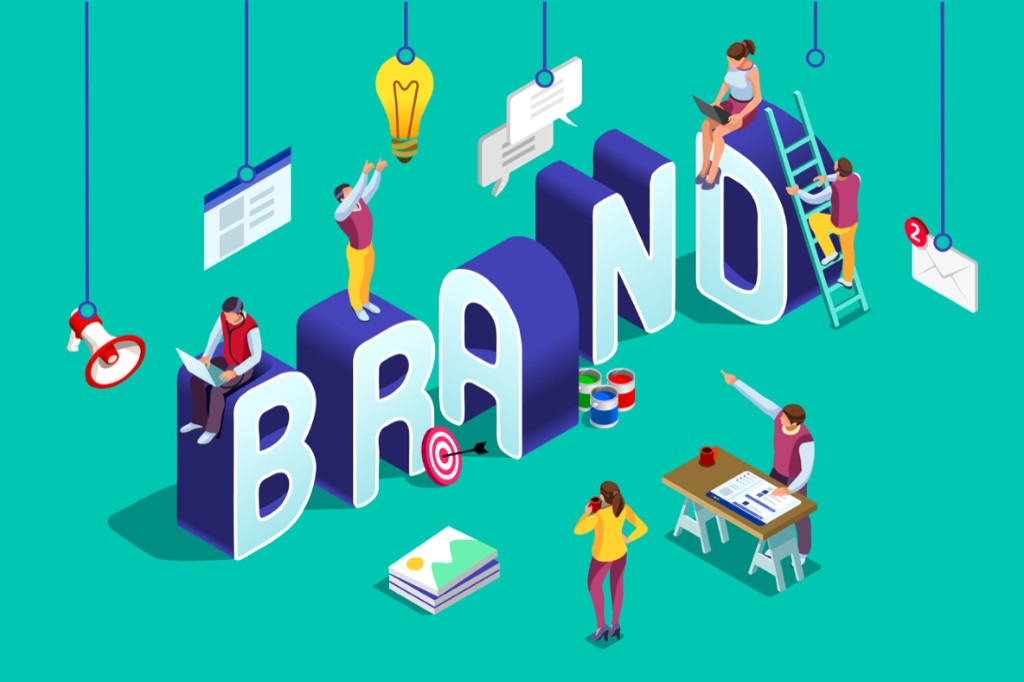
Which factors should you consider when looking for professional help with your brand identity?
It’s easy to get caught up in the idea of ‘having a brand’. You might think that having a logo, a color scheme, and some basic messaging together will give you a strong foundation for building your business. But it’s not as simple as that. A strong brand identity is the result of careful thought and planning, and it can take time to build.
There are a number of factors that you need to consider when building your brand identity. The first is your target audience. Who are you trying to reach? What kind of person are you trying to attract? Are you selling to women or men? There are many different factors that can affect how people perceive your brand identity. Next, look at your competitors. It’s easy to see what other brands are doing if you compare them side by side. How can you differentiate yourself in an effective way? Finally, think about how your brand will evolve over time. You will want to be sure that your logo and tagline can evolve with the times without feeling too out of date.
There are a number of things that you should consider when looking for professional help with your brand identity. First, you need to make sure that you’re hiring someone who has experience doing the kind of work that you need to be done. Second, you need to be sure to choose someone who has good design chops and who is able to think critically about the elements of your brand. Finally, you need to be clear about what you want from the designer and what your budget is. Once you have all of these things in place, you can start looking for a designer who fits your budget and schedule.
That’s why ATermedia is the best choice to work with we have the best talent team with more than 5 years of experience working with small companies to big companies, trace a big smile on the face of our customers and we want you to be the next one so feel free to contact us we are waiting for your touch thanks.
media@aternet.io